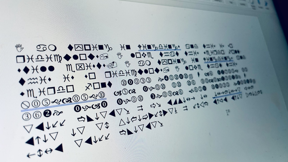
Here’s a tax-related question you’ve probably never considered but now can’t seem to get out of your head: What would happen if you wanted to be a little cheeky and stick it to the man by filing your taxes – which includes your income from illegal sources! – in the infamous Wingdings font?
Let’s consult Reddit.
With quite a debate sparked in the r/tax subreddit, there are a number of theories that exist over what would happen if you submitted your 1040 form in Wingdings. Some believe you might simply be fined $5,000 for submitting a frivolous tax submission, reflecting “a desire to delay or impede the administration of federal tax laws.” Given the extra time you’re forcing someone to file your return, this seems like a very likely scenario.
Others believe the IRS wouldn’t even waste the time trying to get the needed information off the form and would just ask you to refile – whenever they get around to that. Some wonder if the IRS systems would even be able to read a 1040 in Wingdings which, again, would probably trigger the agency reaching back out to you.
In the end, submitting your taxes in a Wingdings font will probably do nothing but create extra headaches for you. Even with an absurd $80 billion going to the IRS over the next ten years to aid in agency efficiency and bring it into the 21st century, there’s a good chance nobody is going to bother with this if they can help it.
However, if you’re really lucky, this could be a great way to increase the odds that you become the subject of an audit, which is, by its definition, the failure to report all your income. Sure, the IRS is notoriously backed up, but some of that $80 billion is going to hiring more workers, and you know that’s not going towards enforcing anything rich people are doing to get around paying their taxes. They’re going after low-hanging fruit like you, the jokester who submitted their taxes in Wingdings.
So if you do intend to file your taxes in Wingdings, expect to probably be put on some IRS list for the rest of your life.
Why Does the Wingdings Font Even Exist?
If you’re old enough to have, well, ever used a computer, then you know about Wingdings, the dingbat font that was at one time the go-to joke for kids of all ages when writing school papers. This series of fonts was originally developed in 1990 by Microsoft after buying the rights from Charles Bigelow and Kris Holmes (designers of the Lucida font) by combining glyphs and symbols to form an image-based font.
Basically, Wingdings fonts were supposed to function like old-school emojis, allowing users to add a little splash of imagery to documents, but people interpreted it as something of a secret-code-type font, and it became a solid source of fun for early computer culture.
And because we’re also talking about the early internet here, not even Wingdings could escape being part of a few hoaxes in its heyday, likely sent around in chain emails with subject lines like “Re: re: re: re: re: re: WINGDINGS 9/11?”
Wingdings was at the center of a couple New York-centric controversies, actually. First, in 1992, it was discovered that “NYC” in Wingdings would render as a skull and crossbones symbol, the Star of David, and then a thumbs up, which was largely seen as an antisemitic response to the city’s large Jewish population.
Not a great look at all, though Microsoft insisted it was merely a coincidence this happened, as the generation of the Wingdings font was random. In a later iteration of the font, it was intentionally rendered to an eye, heart, and city skyline in reference to the “I Love New York” logo.
And then, after 9/11, a hoax went around that if you typed Q33 NY – the supposed (incorrectly, mind you) flight number of the first plane to hit the Twin Towers – it would bring up a Wingdings sequence that featured a plane flying into two rectangular sheets that could be interpreted as buildings, followed by the old standby of the skull and crossbones and Star of David. None of this, of course, was true.
Is Wingdings Still Around?
You can still use Wingdings in your documents, though in our emoji-obsessed culture, the font series has certainly lost its novelty luster. For the ’90s kids out there, it’ll probably always hold a special place in our hearts as a weird little “cheat code” of Microsoft Word, and a symbol (pun certainly intended) of what it was like to try and navigate that weird world of computers and internet becoming a ubiquitous presence in our lives.
